Response to Anil’s “All Dashboards Should Be Feeds”
I like Anil’s general line of thinking, especially for “what’s happening right now” kind of analysis. A couple thoughts though about why feeds are good for some things but not necessarily all things:
1) I’m not entirely sure that the feed actually does help you “make decisions” any more than the dashboards. The advantage of the feed is that it makes you have a reason to come back, because it pulls out interesting nuggets of signal out of the noise. It’s more addictive, and in the context of ThinkUp, it will probably keep people coming back more frequently.
2) For example, what analytics would you want in order to measure the success of ThinkUp as an analytics dashboard? Number of installs, monthly active users, daily active users, number of people on site right now, etc. Keeping people coming back frequently is a pretty common desire of apps these days, and I am not sure a feed is the right metaphor to track that kind of information.
3) My favorite data visualization of engagement is BY FAR funnel analysis (which Mixpanel is pretty good at, starting with explaining what it is).
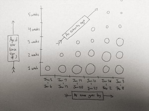
4) My second favorite is cohort analysis where X is “week”, Y is “weeks since user first signed up/subscribed” and the size of the circle at that point is the number of people of that “age” who visited/bought something/etc that week. It’s a lot of data but it is very easy to find patterns (and make decisions based on the patterns) along the X-axis (which answers “as weeks go by, what changes?”), Y-axis (which answers “what was the spread like of the various cohorts this week?”), and the diagonal axis (which answers “how does a each individual cohort evolve over time?”). It looks something like this:

In short: while the feed-model is rewarding as an experience, the task of finding meaning, knowing what you want to know and what to do with that knowledge, is still relatively difficult to extract.